- Load the R package we will use
Question: modify slide 34
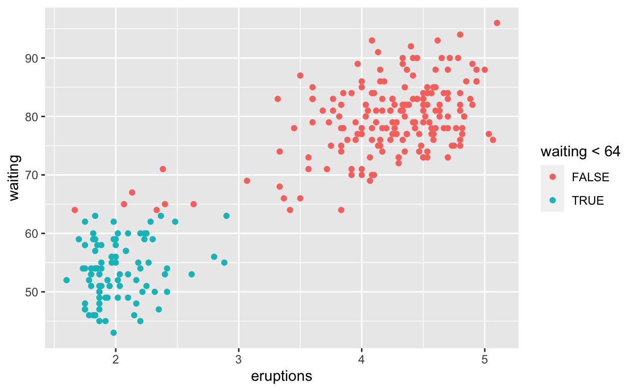
ggplot(faithful) +
  geom_point(aes(x = eruptions, y = waiting, colour = waiting < 64))
ggsave(filename = "preview.png", path = here::here("_posts", "2021-03-30-exploratory-analysis"))
Question: modify intro-slide 35
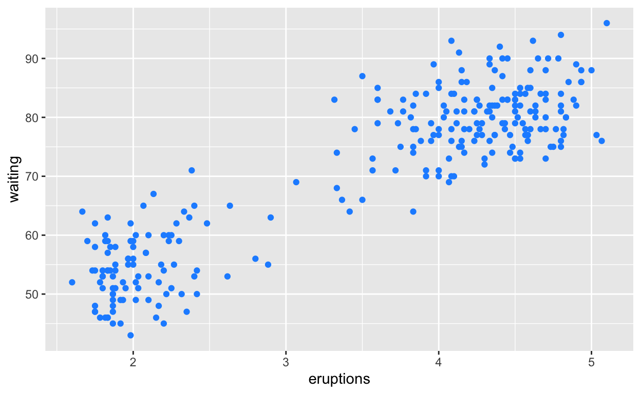
ggplot(faithful) +
  geom_point(aes(x = eruptions, y = waiting),
             colour = 'dodgerblue')
Question: modify intro-slide 36
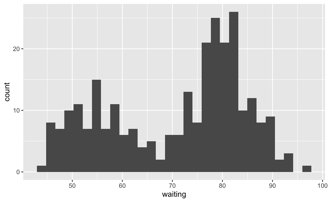
ggplot(faithful) +
  geom_histogram(aes(x = waiting))
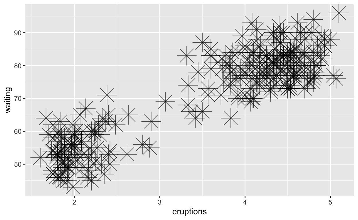
Question: modify geom-ex-1
ggplot(faithful) +
  geom_point(aes(x = eruptions, y = waiting),
shape = "asterisk", size = 8, alpha = 0.7)
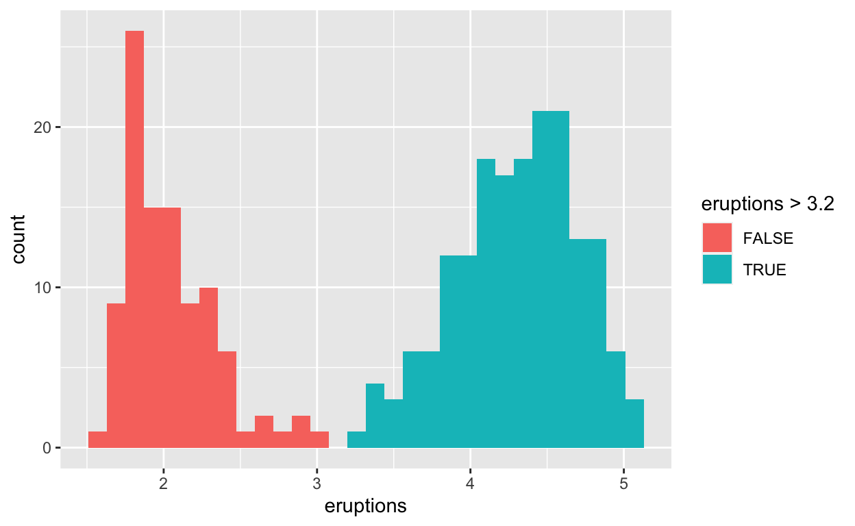
Question: modify geom-ex-2
ggplot(faithful) +
  geom_histogram(aes(x = eruptions, fill = eruptions > 3.2))
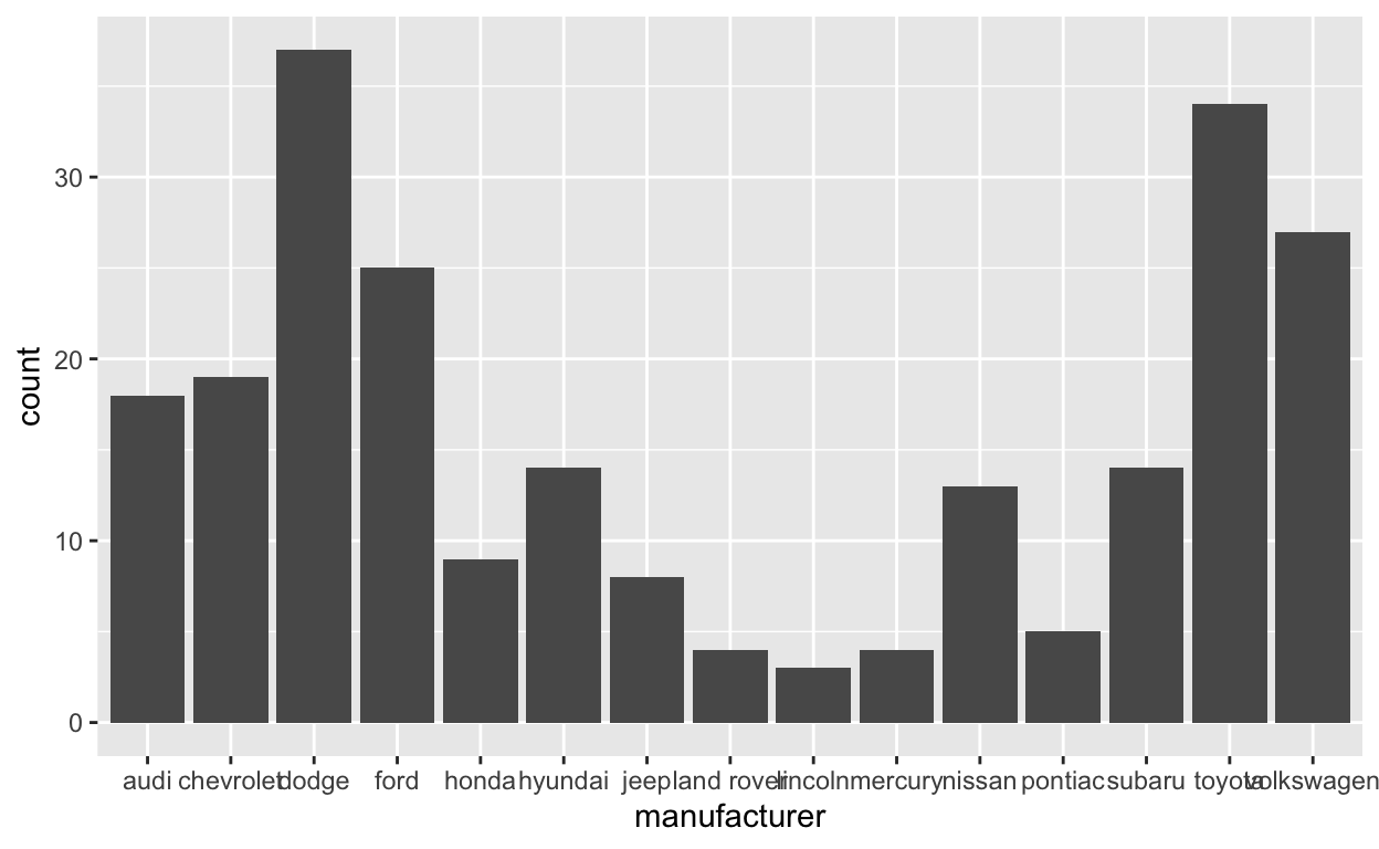
Question: modify stat-slide-40
data("mpg")

# variable definitions
# ?mpg

# mpg  %>% glimpse()


ggplot(mpg) +
  geom_bar(aes(x = manufacturer))
Question: modify stat-slide-41
mpg_counted <- mpg %>%
  count(manufacturer, name = 'count')
ggplot(mpg_counted) +
  geom_bar(aes(x = manufacturer, y = count), stat = 'identity')

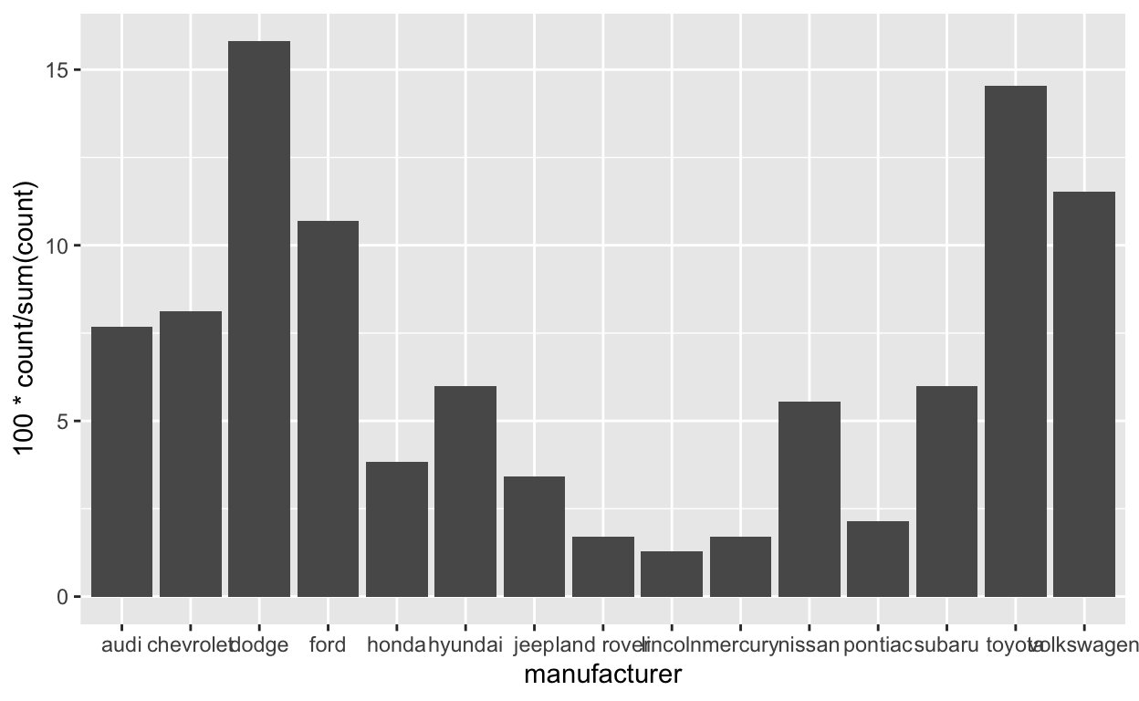
Question: modify stat-slide-43
ggplot(mpg) +
  geom_bar(aes(x = manufacturer, y = after_stat(100 * count / sum(count))))
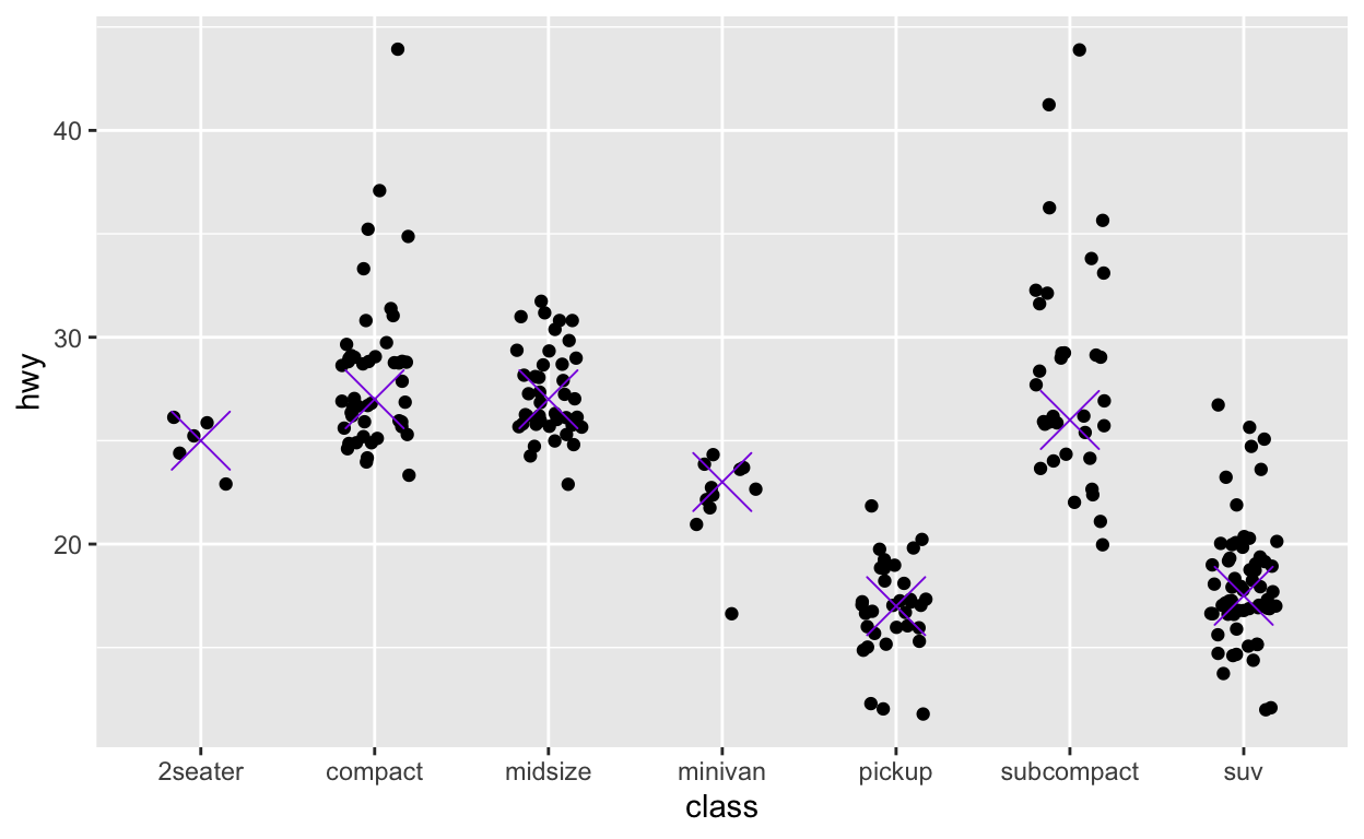
Question: modify answer to stat-ex-2
ggplot(mpg) +
  geom_jitter(aes(x = class, y = hwy), width = 0.2) +
  stat_summary(aes(x = class, y = hwy), geom = "point",
  fun = "median", color = "blueviolet",
  shape = "cross", size = 9 )